Tuesday, 8 August 2017

Cairn on Scottish Beach

So I set myself a task for today to create a new linocut that uses line around the coloured areas, or at least that a dark outline would play a key part in the composition.

Maybe I selected the wrong subject for my composition last night, but anyway, it took me a long time to get started this morning, maybe it was the rain today and that it felt more like late October than flaming August, but I found a whole lot of things to faff about with this morning, including going through my box of maps and booklets from past travels...


...which left me feeling oddly bereft and wanting to escape my life.

Well I had to do the next best thing and escape into a picture.  A little time travel back 3 years to a holiday to Ullapool and a lovely pebble beach which we always seemed to stop at on our way back from our daily travels.  It was always just before dusk and the beach was always deserted.  At least in my memory it was.


I had never seen a cairn before travelling to Scotland.  I remember seeing hundreds of them beside the road travelling up from Fort William to Ullapool on our first visit there in 2009.  We stopped in a parking area and joined the Japanese tourists marvelling at these strange otherworldly structures.

Since then I've got a little more used to finding them in far flung places.  We've built tiny ones of our own, but they were mere squibs compared to some of the fantastic Gothic heights others have achieved.  The cairn in the photograph was one of these 'found sculptures' long dismantled by the elements I now imagine.  And all the more poignant for that fact.


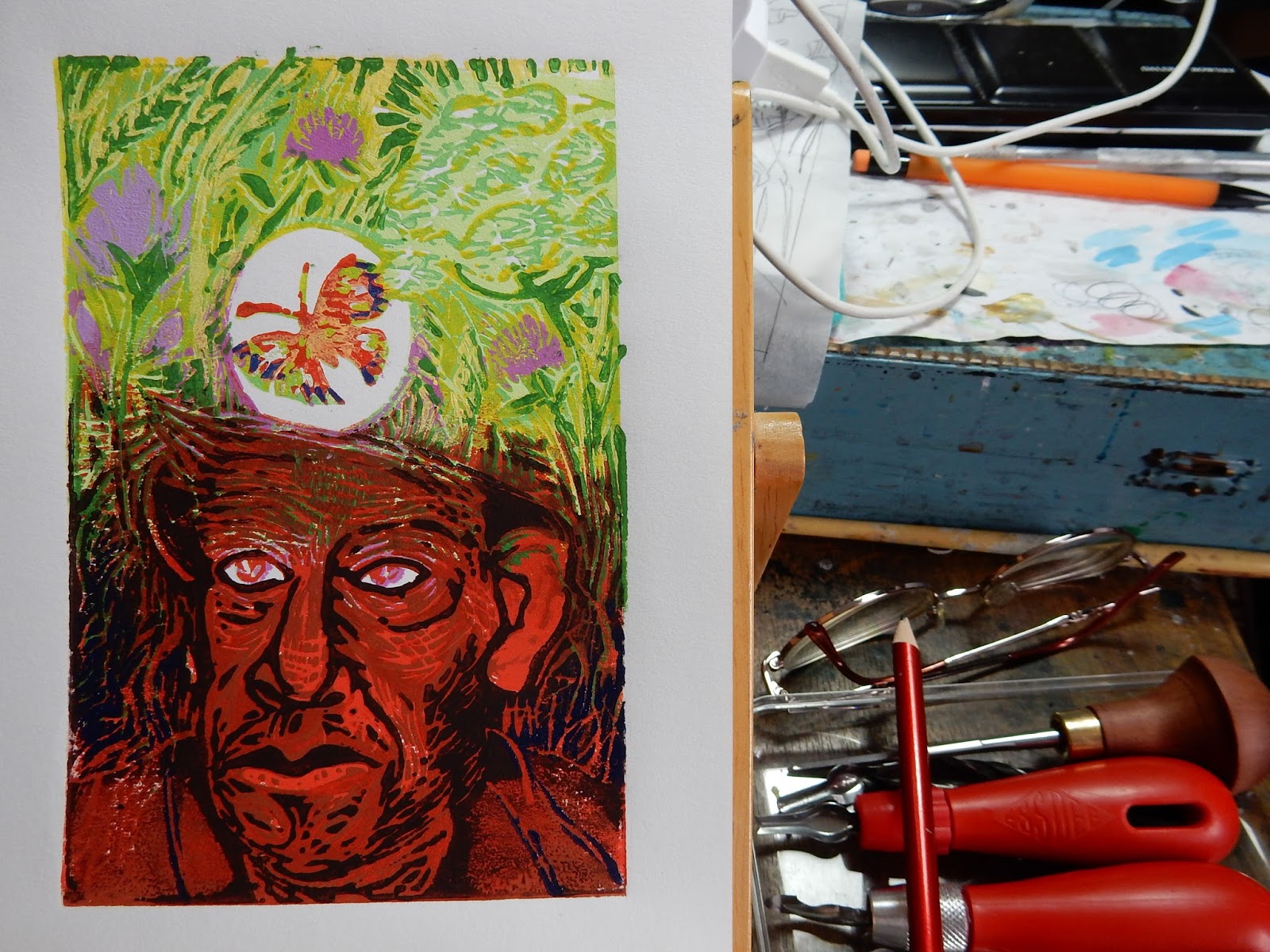
 Anyway I eventually managed to quit my faffing about and sketch my composition then trace it ready to transfer to the grey lino block.


I usually keep my initial drawing very basic as I want to make my real drawing when carving the lino block.  Otherwise I feel that I am just copying my own drawing and this kills any spontaneity in the process.  I did draw a little on the block to clarify my design, and made a few notes as to how I wanted to start carving.


So I started carving, and eventually, pulled 10 initial prints from my block.


And now it begins to occur to me that making an outline a major part of this design might be more difficult that I had thought.

Monday, 7 August 2017

Flamborough Old Lighthouse

I've taken photographs of lighthouses when on holiday for years now.  I'm always drawn to a lighthouse, for many reasons.  I used to have a romantic idea that a lighthouse keeper would be my dream job, it's an ivory tower with a purpose, and the view from the top is usually glorious.


I started making art based on my digital library of photographs the year before last, when I began selling ACEOs on Ebay.  Old Flamborough Lighthouse was one of my subjects and I sold a couple of these pocket sized artworks on-line.  


This started a bit of a series for me, and one I have revised since starting to explore creating linocuts.


My new reduction linocut based on photographs I took back in 2003 of Old Flamborough Lighthouse has taken me roughly 3 days to complete.  That isn't 3 days continuous work, but on/off over the 3 days.


I am already thinking about my next linocut.  I would like to produce something that resembles a pen drawing with washes of colour behind the line.  So a black (or almost black) line around the colour areas will be a key part of my new design.  Hopefully I'll start this tomorrow.

Tuesday, 1 August 2017

Meadowhead Finished

After a short break I finished Meadowhead this morning.

A couple of days ago I mixed up a dark reddish colour and rolled this over the bottom half of the lino plate.  I wiped some of the pigment away from the miner's coat area as I didn't want it to disappear entirely into the darkness.  This gave a more gentle feeling of something disappearing into shadow rather than a harsh linear delineation of the coat, which I didn't want.


This morning I dabbed a little blue on the plate over the edges of the butterfly wings and then printed from this.  I used a small paintbrush to apply the ink to the plate.


Then I cut away some of the miner's coat and cut into the roots and the darkness around him to give a feeling of depth and layering then brushed over a blue with extender added to it in the area around the miner's head and the remaining defining lines of his jacket.  I used a small square brush to apply blue onto the plate then printed from this.  I really didn't want to get any blue on the upper meadow area of the print as I wanted the contrast to be as great as possible between subterranean darkness and brilliant sunny summer meadow.


The finished print, 'Meadowhead'.


I had quite a bit of the blue left when I had finished, so I added a little red and white to produce a kind of subtle grey.  I printed 2 prints from what remained of my linoplate from this.  Cut into it a little more to leave just the most basic of lines, and rollered a darker version of this pale grey pigment over the bottom half of the plate to produce this monochrome image.

When it is dry I will do 'something' else to it, not sure what yet, to give it some kind of completion.  I think it will make a nice complementary pair to my main edition of 10 prints of the miner emerging into, or thinking about, his wildflower meadow.


Friday, 28 July 2017

Meadowhead Printing Day 3

I've made considerable progress on Meadowhead today.

Here are some of the stages my print has gone through...


Printed red, which immediately added drama to the composition.  I want there to be a feeling of blood in the dark earth, blood of the earth and of the life within it.


The life force within the earth and the lives of those who go down inside it to mine what what has died and become precious within it, be that 'black diamond' or other substances mankind mines for profit.


To lighten the butterfly (I've modelled it very loosely on a Red Admiral, because I've been visited by a particularly frenetic one in my back garden these past 2 weeks) and to put a little more vibrant sunshine into the meadow, I printed an opaque yellow in areas of the top half of the print - I applied the ink to the plate using a brush because a roller would not give me the definition I required.


A more dramatic addition is the green I added both in the grasses above and down into the subterranean darkness where plant roots reach for nutrition and where the miner toils at his work.


Finally for today I have added a second darker red in the lower areas of the print, this gives more definition to the miner's features, also I have overprinted the lower green areas to darken the green/soil areas and to start pushing back a background area around the miner's face.

That's probably going to be it for today.  Partly because the paper is saturated with ink - although the ink that I use is fast drying, it is still sticky with the layers I've printed today.  I'm also tired.  To be honest, cutting and printing repeatedly takes its toll on me, both physically and mentally.  I know that sounds wimpy, but at this moment, although I really want to carry on with this print, in my head I've had enough of it!!!  

Hopefully I'll be fresher in my head when the ink has dried on the paper. 

Thursday, 27 July 2017

Lilac and White

I've made a little more progress on Meadowhead today.


I added lilac to the flower heads and continued this colour down over the miner's eyes as I want to start building up a feeling of shadow and solidity in the lower half of the picture.  It's going to be mainly red to black in the bottom half, but I thought a few lilac lines around the eyes and forehead might give it a transitional zone where the daylight is breaking through the subterranean gloom.


I like the way the eyes are appearing peering up from the gloom.

I carved a little more out of the plate intending to add the red next, and then I realised that I had missed one of the flowers which should have also been printed lilac.  So I re-printed another shade of lilac and also, while I was at it, added a little white on the butterfly wings.  I added the colour to the plate using 2 small paintbrushes, one for lilac and one for white.  I marked the back of the print lightly with 2 pencil circles to show where I would have to rub to transfer the ink from the plate, and then printed...


I make a few notes when I create reduction linocut prints to organise my thoughts as to what order I need to cut and print each colour layer in.  As this print is building in quite a complex way (I'm really printing in 2 halves: green and red/black, above and below ground) so my notes are a bit more involved.  And (like train timetables) subject to changes...

Wednesday, 26 July 2017

Meadowhead

It's been over a year since I posted last, and during that time I've worked on my pen and ink drawings, exhibited some, been awarded a Prize and sold a few.  I've been very fortunate there.  

I continued producing ACEOs (small playing card sized works of art) to sell on Ebay.  I sold these via auction quite regularly for a while and it was a good experience as it helped me find a professional way of selling my art, something that took courage on my part, and also something that I should have attempted to do many years ago.  

Earlier this year, I don't know why, but I dug out some lino cutting materials I bought about 3 years ago from a shop that isn't there anymore (where have all the art shops gone?  To that shop heaven called 'on-line').  I made a linocut of artist Frida Kahlo and, taking courage from my the selling experience gained from selling my ACEOs and other small scale artworks, I posted it pretty much immediately on Ebay as an auction.  It didn't sell, but I found that far from finding it a wrist breaking frustrating exercise of crumbling lino and sliced off fingers I actually enjoyed the process of cutting lino.  It reminded me in many ways of making a pen and ink drawing, of chiselling out an imagined space in 2D.  I quickly realised that after years of working pretty much exclusively in black and white in my dip pen and ink work, I now had a chance to expand graphically into using colour, something that I had not managed to do previously, despite various attempts at using other materials alongside India or acrylic ink applied with dip pen.  


I very quickly began using colour in my linocuts, firstly simply printing the linocut plate in a single colour, then by applying a second colour to the single linocut plate and printing twice, using a registration device I made myself from corrugated cardboard (Youtube is a great resource for linocut advice).  I made my first reduction linocut print of La Corbiere Lighthouse.  I enjoyed the process, though it is quite tiring as I hand press my prints, as I don't own a press and have very limited space to work in.  I have made several reduction linocut prints since then (March 2017) and am now embarking on my first imaginative linocut composition, which I am calling Meadowhead.

The plate I'm using is small 4 inches x 6 inches (the same size as my Corbiere print).  I print small as I hand press using a dessert spoon and I'm not sure I have the energy to print much larger prints this way.  Though no doubt I will try before long.

The inspiration for the Meadowhead composition comes partly from my heart, partly from the imaginative sparks that occur when I'm tired and drowsing in the sun (I saw the image of a coal miner emerging into a field of wildflowers in a half-waking moment) and partly it is the result of my reading recently, John Lewis-Stempels Meadowland and thinking about my family history, my great grandfather died in a mining accident in the Black Country at the beginning of the 20th century.  We are what we do for a living, and sometimes what we do for a living does for us.


I sourced photographic images, some from the Internet, others are my own digital photographs of wildflowers taken recently.


I made sketches using the photographic material, then refined this using tracing paper.  Though I really don't want to over plan as part of the joy of a linocut is treating the cutting as a drawing process, and the ink application as a painting process.  

First application of colour after initial cutting, a pale yellow with green tinge to the top 'meadow' half of the linocut print.


Second application of colour of pale green.


Third application of yellow mixed with a little extender to increase transparency of the ink.


Thursday, 14 April 2016

Space Dogs!


 I'm feeling anxious about my new drawing, I'm not convinced that I've grasped the whole shape of the tree in the picture yet, and am certain that I've bitten off far more than I can chew at portraying the millions of tiny blossom and the gauze of twiglets veiling the tree as if the tree is dancing in a veil of twigs and branches.

But then again that was the very thing that attracted me to this subject.


Listening to something while I work helps me concentrate.  Today I've been listening to Black Rabbit Hall as an Ebook from One Click Digital.  I've got a free subscription to this wonderful service (I think it's wonderful anyway) via my library membership of Wolverhampton Libraries.  I believe that many library services are offering this service, another of the myriad reasons to support your local library service by joining up right now! 


That little pencil drawing at the bottom corner is an experimental ACEO.  I'd noticed that lots of people sell drawings inspired by celebrities or cult TV programmes, movies etc... and I had a quick go at starting one last night.  It doesn't look much like the person it's supposed to be though.  When I was a teenager I was good at catching a likeness but I seem to have lost the nack.


Last year a lady in Belgium bought my ACEO Walking The Dog In Space.  She is connected with a dogs charity and asked me if I would mind if she produced a small number of stamps for personal use using my design.  I said okay and today these came through the post.  I think they look really nice and they've really brightened my day.  I love the Belgian postage stamps as well!