Tuesday 3 October 2017

St Paul's Square, Birmimgham

More progress on my linocut of St Paul's church, Birmingham.

I printed a layer of pale green, then an orange...


Then cut some more detail into the trees and leaves and printed a richer, darker green over the orange.


Cut some more detail and printed a darker red/orange then cut for one last time, taking out most of the plate leaving only the trees and the windows of the church itself which would appear darkest in this print. 


I then inked up the plate with a dark reddish black/brown...


And printed this final layer of ink over all the previous layers to arrive at my final print.


I've mixed feelings about the final result.  I chipped away too much of the foreground tree, which could have done with being simpler and with less fiddling about.  I had my pen and ink head on when rendering this tree and it has lost definition on the right hand side as a result.  There are places I like, and patchy areas which are the result of the ink drying out during printing and lack of pressure during the hand pressing process. 

But I like the receding trees on the right hand side of the print, and the rendering of the church itself and the tree immediately in front of that.  These are things I can build on, I think.


Saturday 30 September 2017

Metropolis

I've had a lovely surprise today.  I was en route from my 'day job' over to Birmingham, just about to tuck into a cheese and onion toastie when I got a 'ping' on my mobile, a missed call that turned out to be the RBSA letting me know that my linocut 'Urban Meadow' had sold. A really lovely surprise and a confidence booster, something which I seem to need as much as other people require caffeine.


It was part of an exhibition called Metropolis which finishes today.  I went along to see it on Thursday and really enjoyed the mix of styles and interpretations of the theme.  There were some lovely figurative watercolours and oils, some very skillful and moody black and white pencil drawings, some interesting abstracts, sculptures in stone, a lovely display of textile work arranged beautifully on the top floor of the gallery, as well as some beautiful prints, which I'm particularly interested in at the moment as I have spent most of this year learning the art of the linocut.  There was a very nice woodcut by Margot Bell of Canary Wharf which I spent a while looking at.  My favourite however was probably the least 'urban' scene, it was a lovely acrylic painting of the ICC Birmingham from the Library Roof by Paula Hamilton.  I really like Paula Hamilton's work and always seek it out when I go to the RBSA as she often has something in the open exhibitions.  I think she won the Prize exhibition a few years ago.  Lovely colourful, sensitive, organic work which I find really uplifting to look at.

On my way across town to the station I walked through St Paul's Square.  Many years ago as an unemployed twenty something I ate sandwiches and drank pop in the peace of this lovely old churchyard.  Birmingham feels like a very different place these days.  Grand Central, where I mistakenly wandered in search of something from a store there, is a nightmare for me.  Fritz Lang might have made something of a futuristic nightmare of it.  It's certainly not my idea of fun.  I like to see the sky without a frame around it and breath real air. 

The trees in St Paul's Square were just turning autumnal and I took a few pictures on my phone.  When I got home I couldn't get their beauty out of my head. A remnant of the old Birmingham before it had a multi-million pound roof put over it.  And I began a new linocut inspired by it.


It's another reduction linocut, an edition of 8.  I'm aiming to make it 'painterly', and started by inking part of the plate so that the paper elsewhere is clean for when I start to apply the 'autumnal' colour.


The second inking is again only in the top part of the paper, and the church starts to come into view.  Next I'm going to add some green areas - still yet un-autumnal leaves and the grass in the middle ground.

It's a 6 inch by 8 inch print on A4 Fabriano paper.  I'm aware that my linocuts are not as polished as other artists' work, this is partly due to the hand pressing.  I press all of my linocuts with the back of a spoon and a bamboo baren, and also the side of my hand.  I have still to buy a press, but I'm restricted by the amount of space I work in.  Maybe sometimes these restrictions can be a positive force for creativity.  It pays sometimes to be restricted in some way as it gives the imagination something to struggle with.  

I have got an idea however of how I can work larger, and hopefully I'll blog more about this later, when I actually get around to doing it!

Tuesday 22 August 2017

Beach Near Ullapool Reduction Linocut Print

So the day has gone quite well print wise and I managed to complete my print.


I chipped away much of the lino connecting the pebbles to emphasise the crescents of orange seaweed, then printed in a rusty orange colour.  I added extender to make the orange a little less opaque as I had done with the blue.  I used torn paper to mask areas of the plate that I did not want to print in an effort to keep the print as clean as possible.


Next I chipped more of the seaweed area so that when I printed the richer red colour patches of the lighter rust brown colour would show through.  Once again I used a mask made from torn paper to preserve a crispness to the print.  I really like the way I can 'draw' the pebble shapes and layer one slightly different sized pebble shape over another to give a feeling of depth and a more complex effect.  It reminds me of certain effects I get with a dip pen and India ink.  It's something I want to explore further in another linocut.


Finally I cut even further into the red areas of the seaweed and printed a darker colour mixed from red and black again adding a little extender, once again using a simple paper mask to protect areas of the print I wanted to keep clean.  I wanted to add some darker areas towards the bottom of the print to turn the bottom of the print into the foreground, as I had done in my Cairn print.

Many linocuts I have looked at over the past few months, although lovely, have a very flat graphic appearance and although I appreciate the graphic nature of this medium, and one which comes more naturally to me than a more painterly approach, I would also like to try to do something more painterly with the linocut.

One thing I have really enjoyed while exploring the creation of linocuts is using colour more in my work.  I have always been someone who draws more than someone who paints, and I feel that with the linocut I have found an approach that allows me to use colour in a graphic way.  And maybe push the use of colour further away from the graphic towards the painterly through use of pattern and revelation of one layer beneath another.

Monday 21 August 2017

Scottish Beach Near Ullapool - It's a little bit mauve

Some progress on the linocut I began last Friday.  It's based on the same set of photographs I used for my Cairn linocut, but this one is half the size as the Cairn print.  It measures 4 inches by 6 inches.  I buy my lino on-line from Ebay.  The lino comes in a variety of sizes but so far I've stuck to two: 4 by 6 inches and 6 by 8 inches (to print on A5 and A4).  I would like to venture larger than A4 but worry that I won't have the stamina to hand press anything larger.

Anyway, beginnings...

I made an initial sketch, traced the sketch and transferred it onto the lino.  I chipped out a few initial marks and started off my edition of 12 in a pale cream colour.

Then I started to cut more detail into my plate...


I printed in a kind of mauve colour which I mixed from about 5 of my inks.  I'm not very technical or systematic when it comes to mixing colours, I should be really.  If I was more organised I would have mixed enough to print the entire 12, as it was I cocked up and ended printing 6 in one shade then (after an intermission of a number of hours and a day out) 6 in a shade that didn't quite match.


But what was worse, in my rush to get the 12 prints done I messed up the texture of the ink and the little white caravans nestling just beneath the far trees disappeared in a gloop of mauve.


Because I don't like throwing anything away I have tried to rescue my oh too blobby prints (there are 2 of them) by sponging white ink over the disappearing caravans and then printing my next layer of colour over this, giving a kind of misty distance appearance. I also printed another 4 prints onto Daler-Rowney Murano Pastel Paper, which is a cream colour, because after mixing the second batch of mauve I found I had misjudged the amount needed to print off 6 images and had lots left over.  So my initial 12 prints has now increased to 16.


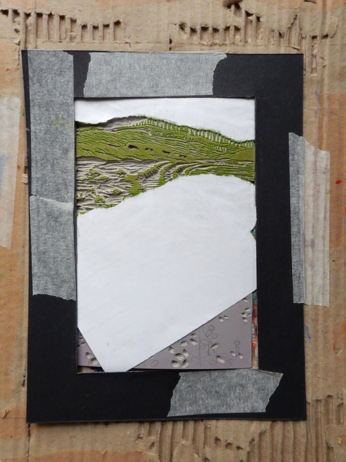
I was a bit perplexed about what colour to print next, but decided that I wanted to add the green of the distant hills.  So I mixed a lightish green and masked off the area around it, as I will be wanting to print another colour here later and so can't cut away any lino there yet.  I made the mask quickly by tearing some paper to the shape I wanted.  The torn edge suits my way of working as it won't give a hard edge to the colour once it is applied and will look more organic and painterly.


Then I chipped away the hills and went through the same process again to apply a darker green for shrubs.

Now I want to give some definition to the beach area, the repeated crescents of the seaweed in the foreground.  But I can't print the reddish colour of the seaweed yet, because I still need to add some kind of subtle definition to the pebbles and the distant hills.  I have made the pebbles way darker than I had intended.  I really saw this print initially as something much simpler than it is turning out to be. I sort of planned for there to be a light expanse of shingle then the contrasting deep red of the seaweed.  And only about 3 layers altogether.  

But I'm learning that with printmaking, even on the domestic scale I am practising, you can't really plan anything and rigidly stick to it.  To succeed you have to be flexible with what the print will allow you do to do.  The process is boss.


So I added a blue thinned out with a generous amount of extender, because I didn't want the blue to be too in your face.  And I wanted the blue to draw the whole composition together, from far distant hills to the pebbles which you are just about to step onto.  

NEXT STEPS:  Hopefully I will finish this little print tomorrow.  I plan to chip out the remaining pebbles leaving just the shapes of receding seaweed.  Then I'll mix up a rusty orange/red colour and roll it over the lino plate and pull my 16 prints.

Then I'll chip out a few more spots in the red seaweed area to add texture to the seaweed and then mix up a darker red colour and print this over my 16 prints.

I'm toying with the idea of chipping out a few more pebbly parts at the very bottom of the print and printing this with a very dark red/black to transform the bottom of the print into foreground.  But I'm not sure if I will do this yet, or if this will just be overkill.


Although it's been a gloomy day it was muggy and humid this evening.  I like sitting outside at the end of the day. I water my plants and deny the snails their feast by peeling them off the sunflowers and rolling them under the gates at the top of our garden.  I know it's futile, but it gives me a feeling of control, false though it is.

I'm sure I saw bats this evening.  I have seen them before, 3 years ago, zipping around the top of our Poplar tree at dusk.  Then a few weeks ago and now this evening, just for about 10 minutes or so, this crazy little creature flying frenetically about, whirling in the air in circles of varying circumference, disappearing into the dark of the poplar, pointed crescent wings fluttering as it flew. Its frantic movements in the air reminded me of the way a butterfly moves, not like a bird at all.  The dimming sky behind it, the darkness of the garden with the solar lights glimmering below.  I think it was a bat, I'm not certain though.  But if it was, to think, bats in the heart of the Black Country.  What a wonderful, unexpected thing.


Tuesday 15 August 2017

Bringing the cairn forward to finish

So I managed to fulfil yesterday's plan and chip out the contents of the foreground pebbles, as well as knocking a few holes and swirls into the brown of the seaweed.  I then mixed a rusty red colour and rolled this in the middle area of the linoplate.  I made a rough mask by tearing some copy paper and placing it over the shingle and the sea to protect it when I pulled the print.

As usual, I placed the plate in my home made cardboard registration device and protected the outer area of the print paper by placing a cardboard frame around the linoplate while rolling out the ink.

For added protection (because I am quite messy and accident prone - more of which later) I also put a paper frame around the inked up plate before laying the paper onto the plate prior to rubbing it with a spoon.  I use a stainless steel dessert spoon.  I tried a wooden spoon but didn't like the feel of it.  I usually rub once all over with the dessert soon, then once again pressing hard with my fist, then once again, more gently, with the spoon.


I left this to dry and dealt with a few other tasks for the day, like painting the fence so that one of our dormant sunflowers can at least bloom a sun shadow onto it...


By which time our resident fat pigeon had feasted on a handful of birdseed, the gnats were swirling in the early evening sunshine, and the ink had dried on my print.

For the final application of paint I decided that I didn't want to cut any more of the plate, as it was already quite flimsy, the hessian was showing through in places (too heavy handed, that's my problem).  Instead I made a mask from copier paper and laid this over the area of the plate I didn't want to print.  I made a couple of these as by the time I had printed 5 of my 10 prints the paper was quite soggy with paint.  I added some crimson to the black and finished off my print.


I'm quite pleased with the results, though I think that perhaps the seaweed area could be subtler.  Still, I had only 2 disasters - 1.  I trod on one of the prints while it was drying on the floor (a bit of spoon pressing and you can barely see the impression made by the ridged sole of my slipper) and 2.  (more annoying) as I was taking a photograph to post here I dropped the camera.  Bouncing off the print it left 2 dimples in the white area around the image.  Arrgghhh!  

Years ago someone suggested that I have Dyspraxia, as I have always been clumsy.  As a child I was forever tripping over.  I was terrible at anything that required co-ordination, especially hand and ball or one leg before the other.

But to tell the truth, it might be that I am really just a thoroughly clumsy so and so!


Quote of the day

'Words are more real when they are in books.'   
The Running Hare - The Secret Life of Farmland

Monday 14 August 2017

As long as the day is short

It has seemed as if there were just not enough hours in today.  Half past eight in the evening and it's dark already, the curtains closed, the light in the cupboard where I sit with my computer spotlighting the keyboard.  It feels more like late October than mid August.

Outside the wind is dashing the sunflowers (which still have not opened, only one, a red velvet bloom).


I had to make a split for its neighbour this evening as it had broken three quarters of the way up its 10 foot or so height.  We have squirrels in the garden, and I fear they may be the culprits.

Last year the sunflowers, which I have grown from seed annually for about the last 8 years, bloomed late, in early September, when I was on holiday.  I came home to a row of headless corpses.  Mum had watched from the kitchen window as the squirrel swung from the stem of each flower until it detached the bloom and ran away with its prize, presumably to gobble it up in the obscurity of next door's gargantuan fir tree.

Three years ago I spent much of the summer drawing the sunflowers which grew big and strong.  In those days, as I remember, the squirrels were nowhere to be seen.


Today's progress began with finishing cutting the lino plate with more detail in the foreground pebbles and the retreating seaweed and to lighten the distant hills, to attempt to give the impression of distance between the cairn in the foreground and the further distance of the pebble beach.

I chose to print this in a dark brown, in my attempt to fulfil the brief I set myself last week of creating a composition which is enclosed in darker lines.  Although to be honest, the design is running away with me somewhat and I'm in danger of not fulfilling my own brief.


Next I turned my attention to the far distance.  I chipped away at the hills as I did not want to alter what I had printed there, and chipped a little detail into the green areas in front of the mountains.  I printed a muted light green which I mixed from a variety of colours, including some magenta, to knock the greeness off the green.  I didn't want it to scream out from the distance of my print.


 Finally for today I chipped more of the green areas and wiped all of the top area of the beach out, except for the little tufts of green seaweed, then printed again a darker green to add foliage to the distance.  I used a piece of torn paper to mask the top part of the sea, as I didn't want any green in that area.

The task for tomorrow is to cut out all the pattern lines in the pebbles and to clean away everything surrounding the streaks of seaweed in the distance.  I'll cut a few pebble and swirly seaweed shapes into the large darker areas, then I plan to print a rusty red/brown over everything that's left.  Then I plan to cut away everything leaving just the bare bones of the cairn and surrounding pebbles in the foreground.  I will print this black, or black with a hint of something or other, to bring the cairn out of the picture plane.  

At least this is the plan.

Thursday 10 August 2017

A browner shade of grey

Managed to do a little more work on my Cairn on Scottish Beach linocut today.  After printing the initial buff coloured layer of the print on Tuesday I began chipping away into the detail of the design.


Working from the 2 photographs I am using as the base for my composition.


This evening I printed the second layer of colour of my 10 prints. 

I mixed up a slightly browner version of the grey I used for the initial layer of colour. 

I had to mix up 2 lots of colour as the water based pigment I use dries out very quickly.  I added some extender to try to make the pigment retain it's sticky yet liquid consistency, otherwise after rubbing with a spoon, my hand, and the spoon again, all I get is a pale freckly misty image.  Which can be quite nice and impressionistic, but in this case it's not really what I want.  I want to be able to see the pigment on the page. 


Tomorrow I'm hoping to begin cutting the lino again.  I'm not really decided which colour to add yet though, I know I want some very muted green in the distance, but I also want to define the strong rust brown of the seaweed crescents on the pebble beach.  Hopefully I will be feeling more decisive tomorrow.